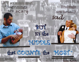
These two designs combine both text and image to display a hand made and postmodern style. These two designs also explore the theme of self identity.
For this first design I went through many different processes to integrate the image and text in a proper way. For the second design the main challenge was deciding how to show the text. I knew I wanted the part of the quote about the middle to literally be in the middle. I went through many different arangmennts to figure out what was right for the design.
 This was the first design that I came uo with and then I quickly realized that the clutter of the eyes, lips and the drawing was too much. Then I played around with a lot of different things and came up with the design below.
 This was the first process of the second design. I changed the word scary because I realized that the viewer would not be able to read it clearly. I also rearanged the text and changed the sizing of a few of the letters to make the words "MIDDLE COUNTS MOST" stand out.


